Every airport needs a website but some stand out above the rest. How do airport websites provide travel information clearly? Is there a particularly great user journey which other airport websites can take note from? How do airports position their brand in 2016? We review our favourite top 10 airport websites of 2016 to look at this in more detail.
Southampton Airport
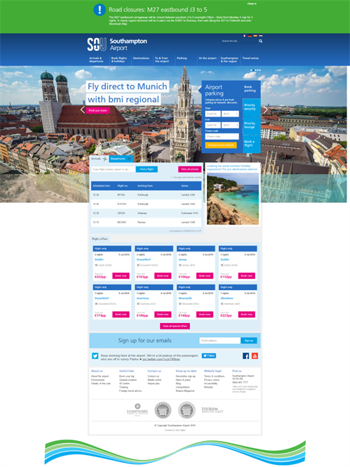
The Southampton Airport website acts as a great representative for Southampton city with it’s modern design and seamless user experience. Thanks to a recent integration with Airport Direct Travel who facilitate flight booking; it’s now possible to browse flights and book parking all on the Southampton Airport website. The customer's requirements are clearly met in the primary feature blocks; parking booking, priority security, priority lounge and flight bookings as the first four key call to actions.
Great for inspiring as well as engaging customers to visit Southampton not only to fly but to maximise the city's potential.
Dubai Airport
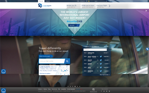
There are so many airport websites which are stuck in the 90s so it’s refreshing to land on the Dubai Airport website which has a simple but modern design. The best part of the site is the way they handle live departures and arrivals, pulling in arrival gate information and baggage links for all live flights - giving no reason for family members to be late in picking up their loved ones. Nice touches are weaved throughout, the ‘D’ for Dubai branding plays a role in shaping up some of the more high level content and there’s a cool little tool which lets you sign up for flight alerts through Twitter. That’s cool, right?
Great for providing detailed and clear travel information for each flight
London Luton Airport
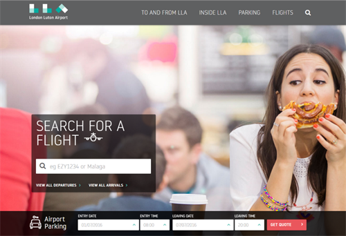
The London Luton Airport website is the epitome of simplicity; it’s shortened down to the name of LLA and it’s block-themed logo determines a number of other stylistic features across the website. Travel advice for getting to and from Luton Airport is handled by funneling users through a number of questions where multi-choice answers are clearly identified with icons and displayed within feature blocks. There is an editorial feel within some of the more content-rich templates which doesn’t get too overwhelming. This website has got character and is a great example of successful branding.
Great for memorable branding and interactive tools to improve engagement
Cardiff Airport
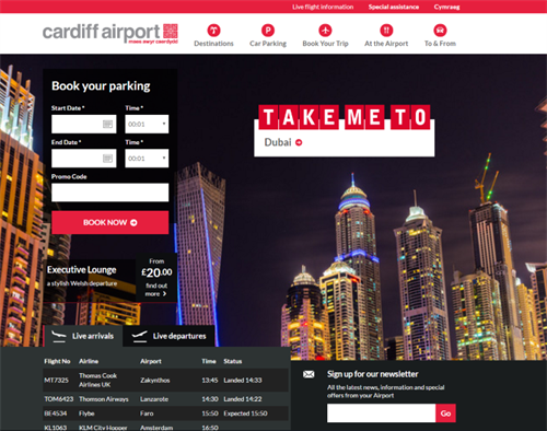
The homepage’s time lapse video and random destination picker can encourage the inner traveller in all of us to get inspired at the idea of hopping on a plane. It’s easy to forget you’re on an airport site here as Cardiff Airport push destination-content and tools which allow you to browse or search for destinations to the forefront. It has an Airbnb feel to it in that respect. When it comes to sealing the deal and booking a flight, Cardiff Airport use Airport DIrect Travel to help search for potential flights. This fully responsive design scales down well on smaller devices; the icon led mobile navigation is a nice finishing touch.
Great for encouraging return traffic by leveraging standard airport visitors to come back to the site for travel inspiration.
Belfast Airport
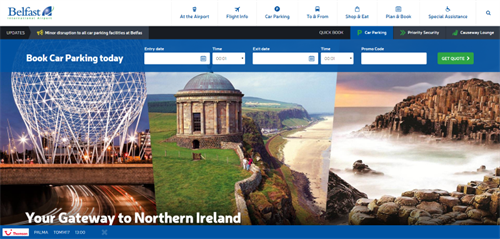
Belfast Airport gives you a fully responsive experience even when on a super wide computer screen; the layout lends itself to the bright and colourful pictures of sunny beaches and streets of New York. Belfast have chosen now to drop the live flight updates further down the homepage knowing most users are likely to scroll anyway.
The destination map section lets you browse flights by Country or Airline which is useful for people who have loose preferences but need a little more help (the only slight downfall with this section is the way you scroll down into Google Maps causing it to zoom in).
Great for encouraging visitors to make an informed choice about their next holiday destination.
Changi Singapore Airport
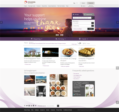
Changi Airport provides a holistic travel experience; not only does it have all the usual airport mod cons but it considers your visit to Changi Airport as the moment where the holiday starts. The in-airport shopping experience is translated well online with a section dedicated to key promotions and zoomable maps which lets you pinpoint how close your favourite stores are in relation to the gates. It also gives you an itinerary of things to do in the airport depending on how long your layby is.
Great for getting into the mindset of their airport visitors.
Malta Airport
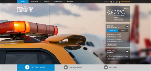
Who would’ve thought it, Malta?! The contemporary design feels light and accessible as well as easy to navigate and find key information quickly and easily. It’s not just the design though, the IA divides visitors into Passenger, Visitor and Corporate which seems like a more sensible ordering. I’m not too sure why airports have webcams but the Malta Airport Apron Webcam lets you check which airplanes have just landed and if it’s still sunny. I can confirm, it’s still sunny in Malta.
There’s a dedicated section for weather, including radar images, satellite images and the option to receive weather alerts. Across the board, airports want to continue a dialogue with it's visitors with flight or weather alerts as well as apps. The dining section lets you browse restaurants easily and even find out if they’ll be open when you’re visiting.
Great for a clear user journey and informative restaurant pages
Perth Airport
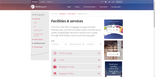
Perth Airport has a clear and modern branding which infiltrates through call to actions, infographics and map views to provide a really polished online experience. Unlike other airports which create multiple pages for facilities and services, all key services show on one page tucked away with an accordion.
Design aside, Perth Airport have learnt the art of displaying all the key content information, airline contacts show customer service numbers, online check-in links and baggage information for all active airlines using the airport.
Great for designing a clean layout that makes the most of images
Copenhagen Airport
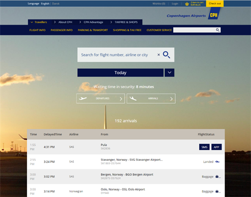
Copenhagen Airport is one Scandinavia’s busiest airports and in true scandy style, it's design seems simple and practical. It’s browsing experience and arrangement of travel information is clear and logical; for example, we love the real time updates of current security waiting time for those regular travellers who hate waiting.
Cross-linking feature content stops readers from hitting dead ends - when reading about check-in, see content about security or passport and visas. Not to mention, the ecommerce store which lets you make the most of online shopping deals by buying online and taking advantage of click and collect.
Our team have travelled to Copenhagen a fair few times for the annual Umbraco meetup, Code Garden.
Great for cross-linking content to increase average time on site and an awesome click and collect feature.
London Heathrow
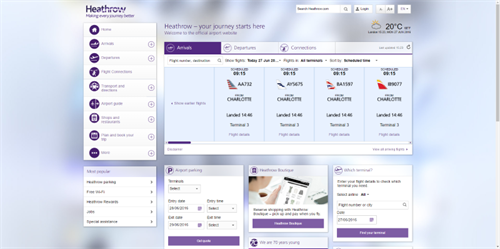
London Heathrow Airport is the busiest airport in the United Kingdom. Despite the airport being so busy, the website is de-cluttered with a unique left hand vertical nav which really differentiates London Heathrow from other airport websites. Celebrating 70 years in 2016, the website is great at dropping in historical moments within useful site content - the airport maps which show where the Queen stood when she opened Terminal 3 is pretty cool.
Great for bringing the airport experience to life through historical anecdotes
We live in a world of technical sophistication, not only are we accustomed to nice web design but we now expect a website to auto-guess our search results or personalise the experience in some way. The airport websites that are doing it well have spent time on their brand positioning, working hard to ensure their website feels light, simple and friendly in a bid to improve conversion, boost brand awareness and ensure they provide the best possible experience for their visitors.
Gibe Digital redesigned and redeveloped the Southampton Airport website, if you’re in need for a new website and you’re after an easy to use content management system, give us a call.

